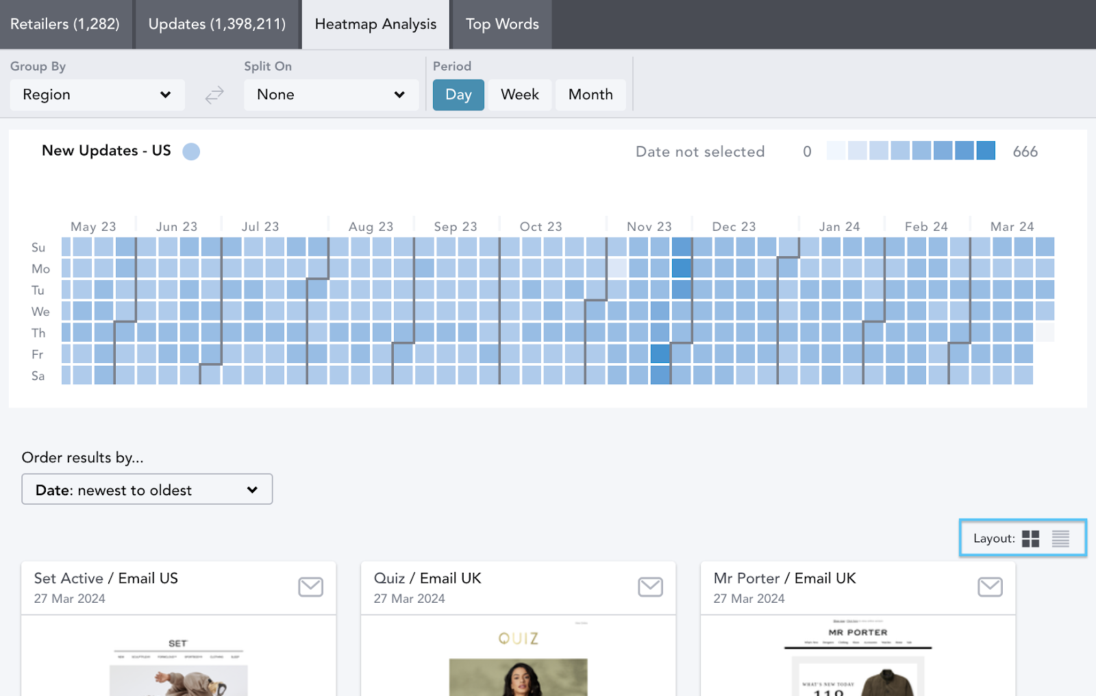
The Heatmap Analysis tab allows you to analyze the frequency and number of communications at a glance. It is located in the top navigation bar.
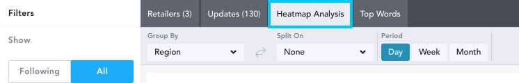
The heatmap tool shows the number of individual updates made across all of the Channels (homepages, emails etc) that EDITED tracks. Use the filter panel to select the retailers, regions, channels, keywords, and dates you wish to analyze.
In the below example, we have chosen to analyze emails at three UK retailers.

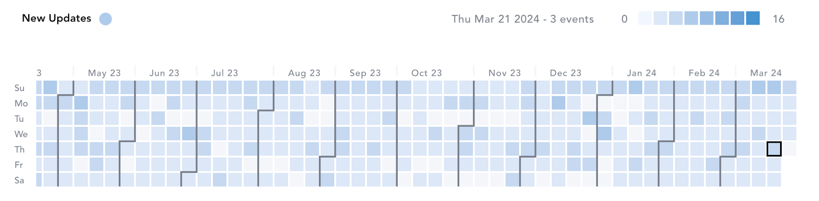
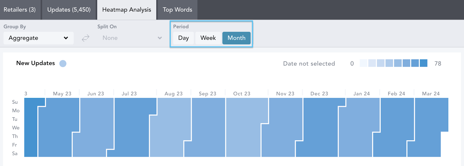
- The vertical axis lists the days of the week. The horizontal axis at the top lists the months of the year. Each square represents a day.
- The darker a square is colored, the more communication updates there were on that particular day. Hover over the squares to see the date and number of individual events.
- Remember that by default, your workbook is set to Past Month unless you remove or change this time frame.
Under Period, you can select to view the chart data by:
Day View
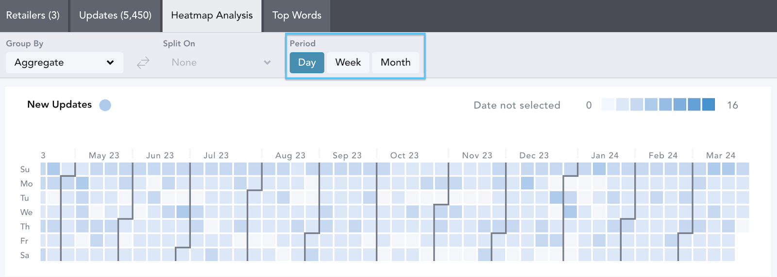
Week View
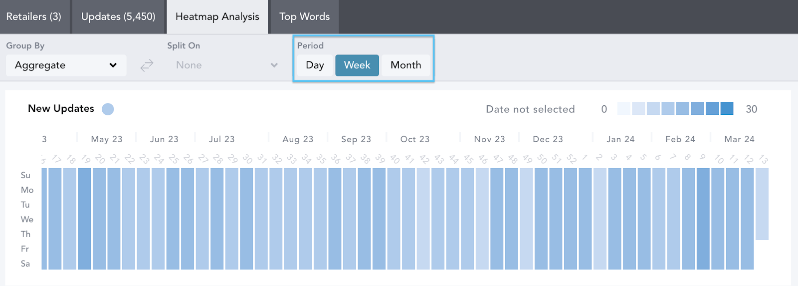
Month View
You can aggregate all the communication updates in your workbook into one heatmap or use the Group By and Split On feature to customize your view. For example, you may want to Group By Channel and Split On Retailer to easily compare how frequently competitors update each of their channels and whether they do so on a set day each week.
Once you have selected what you want to Group By, Split On will become available. Depending on which filters you have selected within your filter panel, you are able to compare communication strategies by:
- Region
- Retailer
- Gender
- Channel
- Keywords
- Date

Adding keywords lets you analyze how and when your selected market is communicating key consumer events, trends or discounting periods. In the example below we are analyzing when “back to school” emails were sent in the UK and US in 2023. To do this, we have selected Group By Region.

Click on a specific day/week/month within the heatmap to update your workbook to view the channel updates for that specific period.
Below the heatmaps are the individual communication updates. Sort the results using the Order Results By… drop-down menu at the top of the page. This can be sorted by
- A to Z
- Relevance - this is the default setting if a keyword/s is applied.
- Date: Newest to Oldest
- Date: Oldest to Newest

There’s an option of two ways to view the individual communications; by communication card or list view. Use the Card and List icons to change your view.