EDITED offers a variety of tools to help you carry out pricing strategy analysis.
Typically, understanding competitors’ pricing strategy is beneficial in two key ways:
- How can I ensure my pricing is competitive within the market, whilst ensuring I maintain margin?
- How can I raise/lower my prices to compete with a competitor I aspire to be compared to and enter their space?
EDITED tracks prices at different levels of the product life cycle:
- Current Price: The selling price of a product’s cheapest SKU, at the time it was last tracked.
- Full Price: The highest selling price that EDITED has ever seen the product at. If the price of a product increases from that when it was first seen, this will become the new full price.
- Advertised Full Price: The highest price that a product has been advertised as sold at, even if EDITED has never actually seen the product sold at that price.
- First Price: The selling price of the product’s cheapest SKU, the first time the product was seen on the retailer’s site.
Below are a few use cases highlighting how you can utilize our analysis tools for your pricing strategy analysis. Keep in mind that each pricing tool offers a different view on pricing insight and could all be used together to form a full understanding of pricing strategy!
OPTIONS
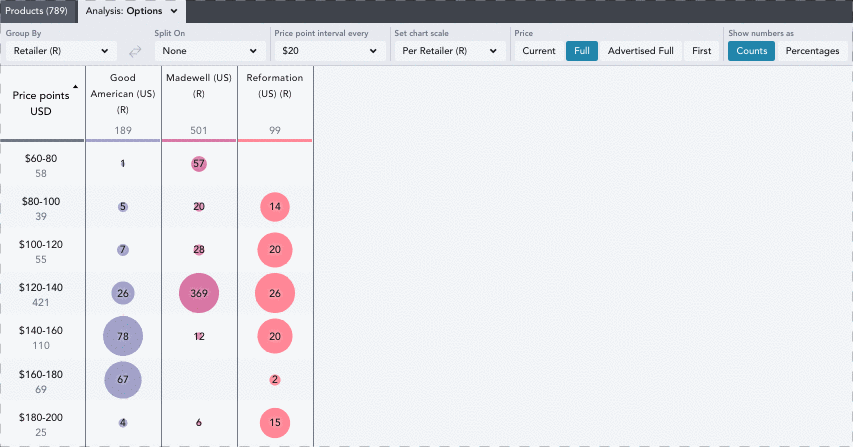
Options lets you analyze the number of products falling into different price point intervals, allowing you to spot gaps or saturation in pricing and establish competitive price points.
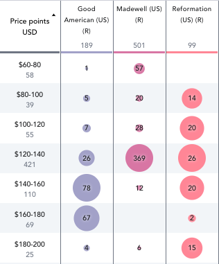
The bubbles indicate the number of products available at each price point, and provide a visual representation of the volume of products per interval. Each bracket contains prices up to $0.99 before the end of the interval, and intervals are customizable using the Price Point Interval Every dropdown.
By toggling the Show Numbers As button within your in chart control, you can choose whether you want to view this chart in product counts or percentages of total assortment.
In the example above looking at women’s jeans, Madewell has some white space in the $140-160 range, where Good American and Reformation have placed 41.3% and 20.2% of their product distribution respectively. By pricing some items in their assortment at the $140-160 range, Madewell can close the gap on that price offering whilst also helping to increase their margin.
Alternatively, Good American and Reformation may notice that Madewell is heavily dominating the $120-140 range, and decide to play into this price bucket even more to offer consumers competitive pricing options against women’s jeans among similar retailers.
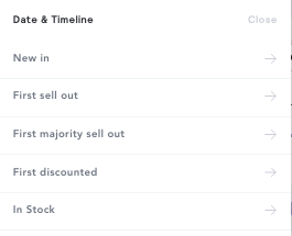
Comparing pricing over multiple time periods can also help you analyze how retailers have adjusted their pricing strategies. Using the Date & Timeline filter, select multiple time periods you wish to analyze, and split on that time period within the analysis chart.
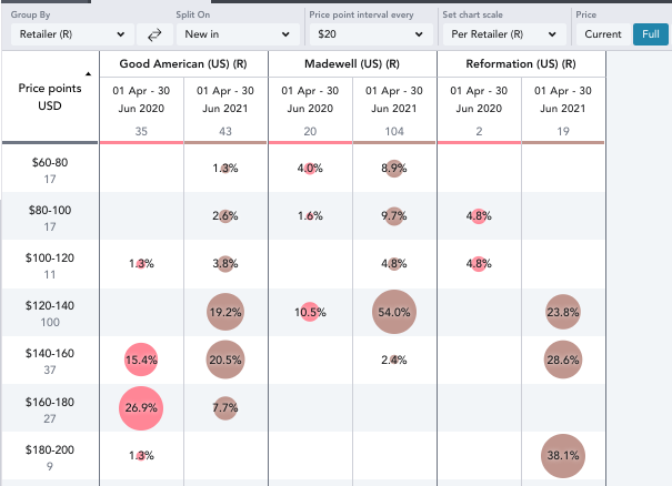
Here, we are comparing New In products between April-June in 2020 and 2021, grouping by Retailer and splitting on New In. You can group by and split on any of the different Date & Timeline filters below and split on these within all of the pricing analysis tools.
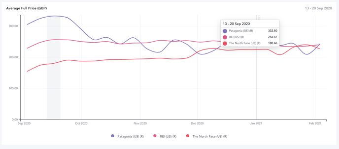
PRICE OVER TIME
The Price Over Time chart is useful in carrying out year over year historical pricing analysis when completing pricing strategy analysis
In this case, looking at the average Full price of all coats across major outerwear retailers in the US last year, you can see where each retailer planned for their prices to sit before discounting.
By toggling the chart to Actual price (the actual historical price of a product’s cheapest SKU), you can gain insight into the pricing strategy, including discounts, across the same time period and what customers were truly paying.
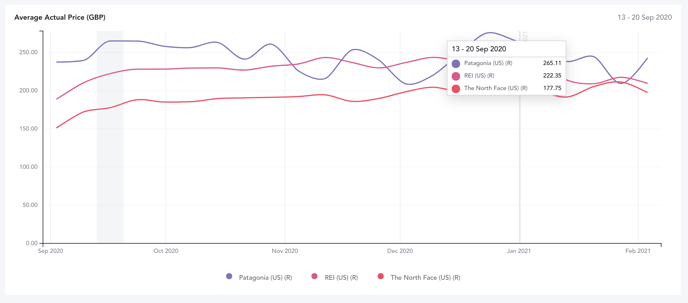
Here, we can see that Patagonia had a high full price spread in September 2020, however their actual pricing line sat roughly 20% lower, indicating discounting in the early Fall. This could represent an effort to move through less successful stock more quickly by discounting or even strategically offering customers a deal on popular items around the time when winter coats are on consumers’ minds.
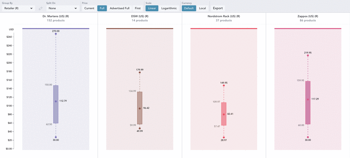
PRICE ARCHITECTURE
When a brand is attempting to reshape consumer perception and target a higher price segment within the market, they can use this pricing tool to study the architecture of aspirational competitor assortments. This allows you to make informed decisions & enables you to break into the space with carefully priced product offerings that consider existing and target consumers.
Price Architecture shows a retailer’s distribution of products by entry, exit, and average price points.
The points on the graph all represent different benchmarks:
- Entry - The lowest product price
- Exit - The highest product price
- Average - The mean product price
- Median - The middle product price
The shaded boxes represent the interquartile range (the distance between the first and third pricing quartile), where the majority of products in a retailer’s assortment will sit.
By changing the scale to Logarithmic, you can view percentage change in values as equal distances from one another on the Y-axis, which can be useful in comparing larger price ranges.
In one use case, selecting multiple competitors will enable you to easily analyze how your entry, exit, and average price points compare. Using this information, you can then make strategic pricing adjustments to either bring down your prices to a more competitive range, or raise them in order to increase your margin while still remaining within a range that customers expect when shopping for that brand.
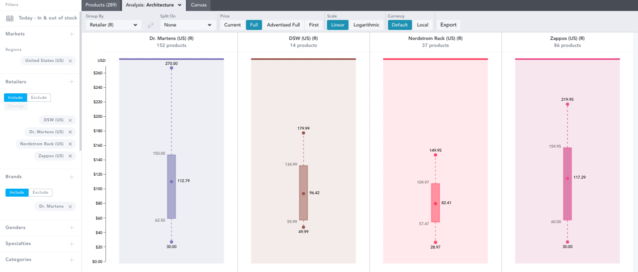
For example, Zappos median price for Dr. Martens shoes sits higher than both Nordstrom Rack and DSW, indicating that they might want to think about lowering their interquartile range to sit closer to other competitors who carry that brand.
Alternatively, a mass market retailer looking to shift the pricing architecture of their assortment towards a higher price point could create a workbook comparing their own pricing architecture to that of brands that sell comparable styles, but in a more premium brand positioning.
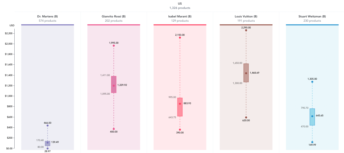
A potential course of action for this retailer would be to examine the entry price point for boot styles at these aspirational luxury brands, as well as the lower quartile of the range. If a mass market retailer wanted to broach this higher price point space, they could begin by understanding the products priced on the lower end of these ranges, and use this to develop and price their own premium product as a transitional strategy.
PRICE INDEX
Users can utilize Price Index to understand where they sit within a category and optimize their pricing, focusing on maintaining margin while also aligning pricing with the consumers’ perceived value.
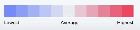
The bottom right cell of the chart is the Index Point against which all of the other prices are compared. The colors on the chart indicate how far the average price point of a product category is from the index point (blue = below / pink = above). The darker the color, the further the price point of that category is from the index in either direction.
Noting where your products fall against the index point can help visualize where you can flex certain prices to drive up margin or lower them to remain competitive, while still keeping your average price spread on target.
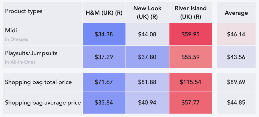
In the above example, a UK retailer in the womenswear midi dress/jumpsuit market may be wondering how they align with the average full price (the highest price that EDITED has ever tracked) for new arrivals in the past twelve months, by using the new in filter for the time range of July 2020 to 2021.
In this example, H&M is sitting in the blue on average across midi dresses and jumpsuits. If they were looking to increase their margin, they might raise their prices slightly on either category, while still keeping their average price at or below the market average to remain in their customers’ expected range.
Alternatively, River Island shows a red shade for both categories, indicating that they may be pricing their dresses and jumpsuits too high if they were benchmarking themselves against H&M and New Look, and could choose to decrease their RRPs to reduce the distance from the market average.