Gathering personalized weekly insights on the retail market is an invaluable tool that EDITED provides for your own market analysis.
Your first step should be to set up a Weekly New-In Workbook in order to track your competitors’ most up to date product launches from the previous week.
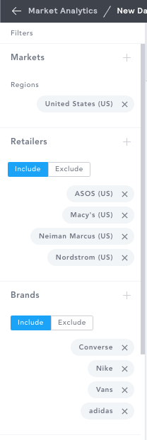
You can use the filters in the Filter Panel to select what you want to analyze in your workbook. Using a combination of the Markets, Retailers, and Brands filters will refine your selection to highlight the competitors you would like to track.
For more on how to apply filters to customize your workbooks and track the most relevant updates to your personal needs, click HERE.
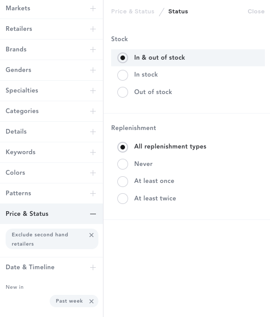
Towards the bottom of the Filter Panel, click on the Date & Timeline filter, and select New In, setting the date range to Past Week.
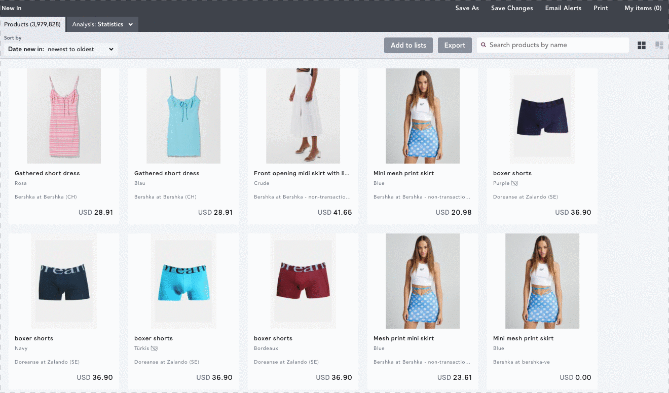
You can then save this workbook, which will enable your workbook to update each day to display all new in products over the last 7 days.
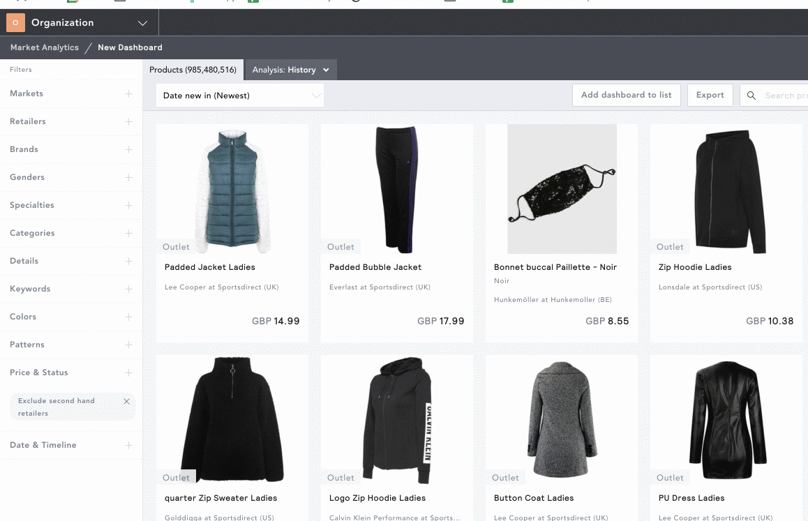
TIP: Remember to remove the In Stock filter under Price & Status for an accurate view of every product available in the last week, even if some of those products have since sold out as of the current date.
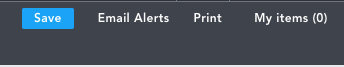
You can also set up weekly email alerts corresponding to this workbook to keep track of new product launches and new first discounts every week. On the top right of your workbook, click Email Alerts. From here, you can select which notifications you would like to receive, and the day(s) and time you would like to receive emails.
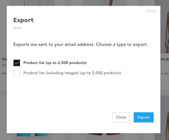
Data from your workbook can be exported or shared for use in your weekly team meetings and analysis. Next to the search bar in your workbook, click on Export and select whether you’d like to export the product list with or without images directly to your email.
To share a specific workbook, you can simply copy the URL link and send this directly to your colleagues, or you can share this within a Teams folder. For more information on creating a Team, click HERE.
Some key ways you can explore weekly insights are through different pricing and product tools within your Analysis tab at the top of your workbook. You can always customize and edit your workbooks to track the most relevant updates to your personal needs. Additionally, once you have set up your workbook, you are always looking at the same data and can therefore click into any of the other analysis tools to see how that data is broken down in a number of different ways.
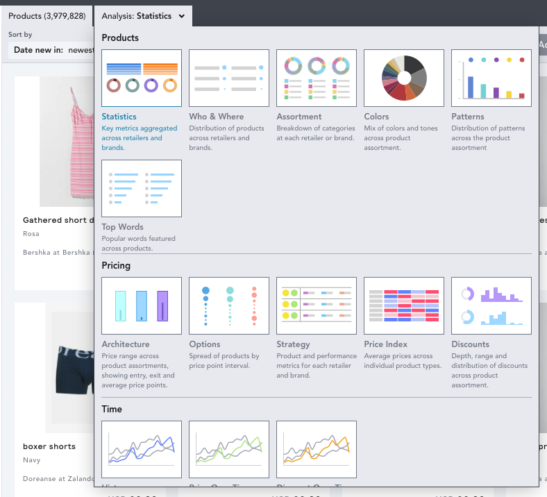
A few examples of product and pricing tools to get you started with your weekly market analysis are Assortment, Color, and Options.
Assortment: This shows the breakdown of product categories within your workbook. Within the Assortment tab, you will see a pie chart with sections corresponding to each product category, as well as a list of the categories below it with a product count breakdown. These charts can be grouped by any of the selected filters in your workbook (i.e. retailer, brand, gender), and can also be split on the same filters for further comparison. You are also able to click on any category title or section of the pie chart, which will prompt a popover to appear displaying every product within that category.
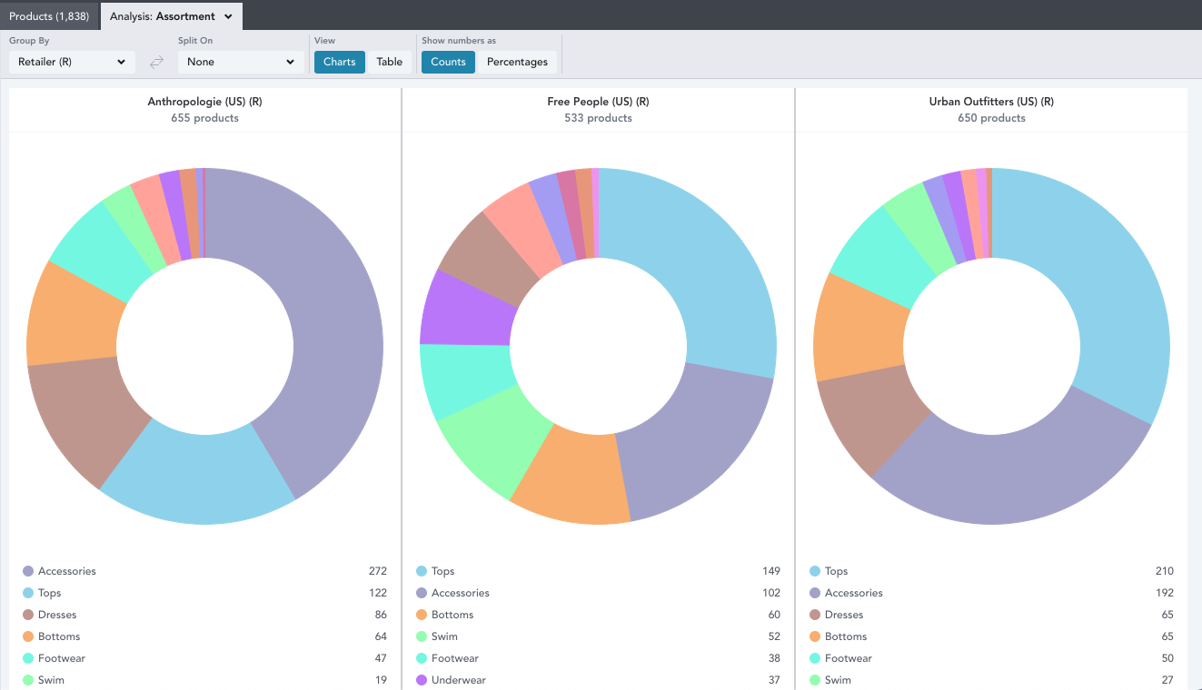
By toggling to Table view, you can see another view of individual product types broken out into table format. You can also change the Show Numbers As field from counts to percentages on either view to see the percentage breakdown across product categories.
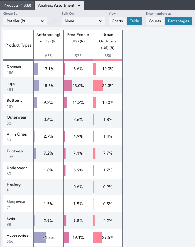
NOTE: You can only view totals in Table view when you have selected more than one retailer and more than two brands in your workbook.
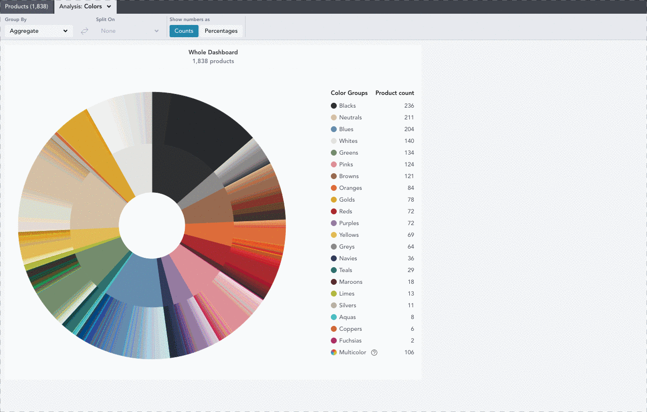
Color: Lets you analyze the spread of color tones of products in your workbook. You can also view this as an aggregate or split it out further, grouping by or splitting on any of the selected filters in your workbook. This tool can help give an at-a-glance view of the color palette each retailer or brand is launching with their newly released products, and which colors are most popular.
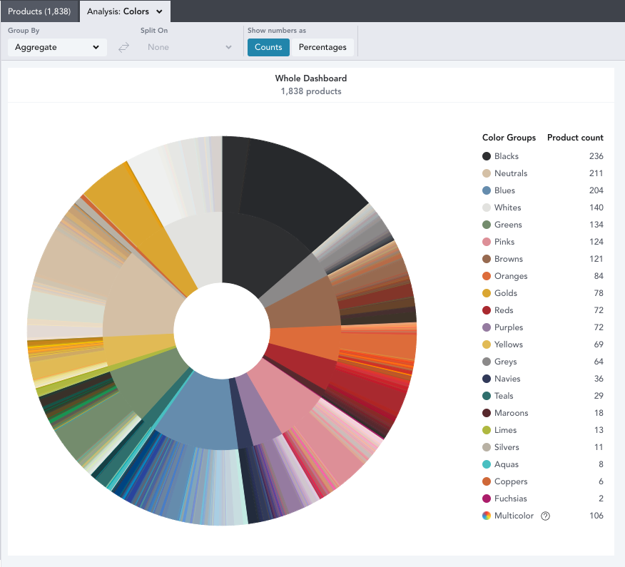
The outer circle on each chart shows all the different shades that products are available in, by TPX code. The inner circle shows the color group of all the individual colors in the corresponding outer circle of that section. The key notes the product count or percentage of products per color group. You can click on specific colors or color groups to view a popover of all products within that color family.
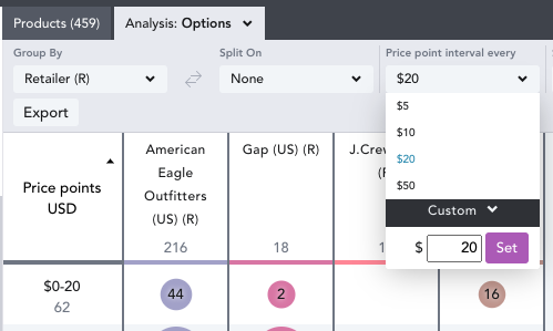
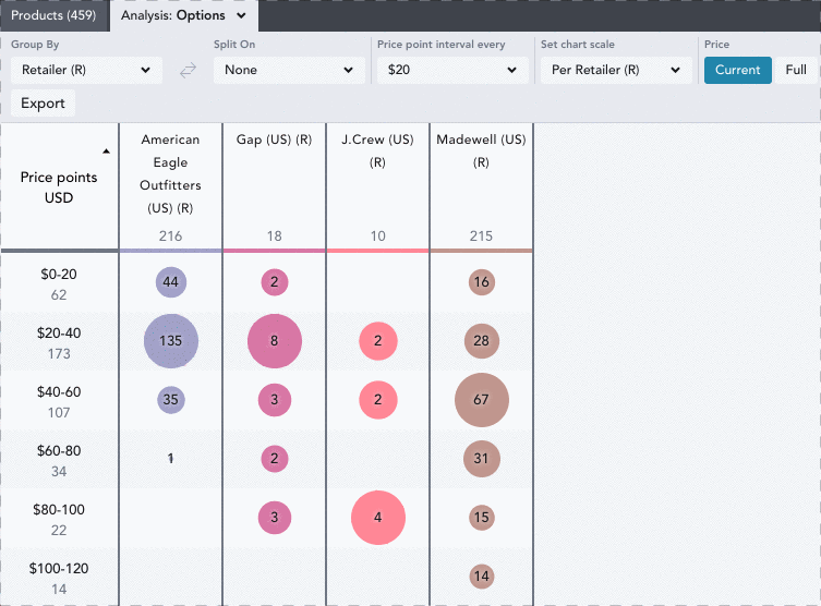
Options: Lets you analyze the number of products falling into different price point intervals, allowing you to spot gaps or saturation in pricing and establish competitive price points. By default, this chart is grouped by retailer, but you can choose to group by or split on any of the selected filters in your workbook.
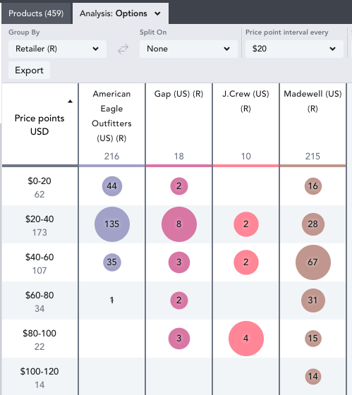
The bubbles indicate the number of products available at each price point, and provide a visual representation of the volume of products per interval. Each bracket contains prices up to $0.99 before the end of the interval, and intervals are customizable using the Price point Interval every dropdown.
To view all products within an interval, click on the corresponding bubble. Hover over a bubble, and a popover will appear displaying the percentage of products within that interval. You can also change the table value to Show Numbers As product counts or percentages.
NOTE: You can only view totals when there are at least two brands selected in your filter panel.
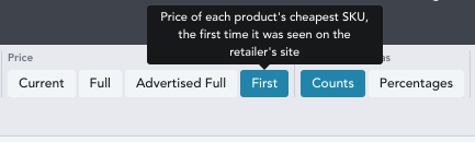
TIP: If you are analyzing this weekly, remember that you will be viewing the current price by default. This is the last price EDITED tracked each product at, which could mean if any new in products had a price change in the last week you will be seeing the most recent price. If you would like to analyze based on the price the product was first launched at, you can change price to first in the control center at the top of your workbook.