- Help Center
- How To Use EDITED Digital & Omni
- Getting Started: Using Charts
-
How To Use myEDITED
-
Interactive Tutorials
-
How To Use EDITED Market
- Getting Started With Competitive Market
- Building & Managing Competitive Market Workbooks
- Using Competitive Market Workbook Filters
- Competitive Market Workbook Advanced Filtering
- Competitive Market Analysis Types: Analyzing Products In Workbooks
- Competitive Market Analysis In Practice
- Classic Competitive Market Dashboards
- Lists
- How Does EDITED Competitive Market Work?
- Sharing EDITED Data
- Market: Understanding Terminology & Methodology
- Frequently Asked Questions
-
How To Use EDITED Digital & Omni
- Getting Started: Navigation & Administration
- Getting Started: Control Panel
- Analysis Types: Dashboards
- Analysis Types: Insights
- Analysis Types: Opportunities (Decision Trees)
- Analysis Types: Opportunities (Action Impact)
- Analysis: Opportunities (Product Badges)
- Analysis Types: Basket Analysis
- Analysis Types: Tasks
- Getting Started: Using Charts
- Getting Started: Exporting, Sharing, Saving & Downloading
- EDITED Digital/Omni FAQ
- EDITED Digital/Omni Data Sources
- DynamicAction Glossary
- Release Notes Archive
- Additional Administration
-
How To Use EDITED API
-
Webinars
Digital/Omni: How Do I Read The Data In Charts?
There are three types of Charts Available:
- Column Chart
- Bubble Chart
- Trend Chart
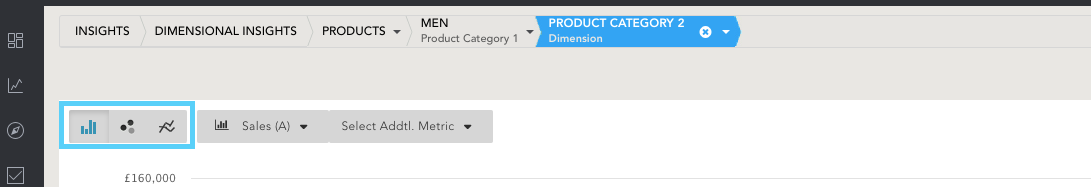
When the chart feature is open, as highlighted in the image above, users can switch between the charts using the icons located in the top left corner.
Column Chart
When users open the Charts view, a column chart appears by default. The only exception is when a user has selected 1000+ data types.
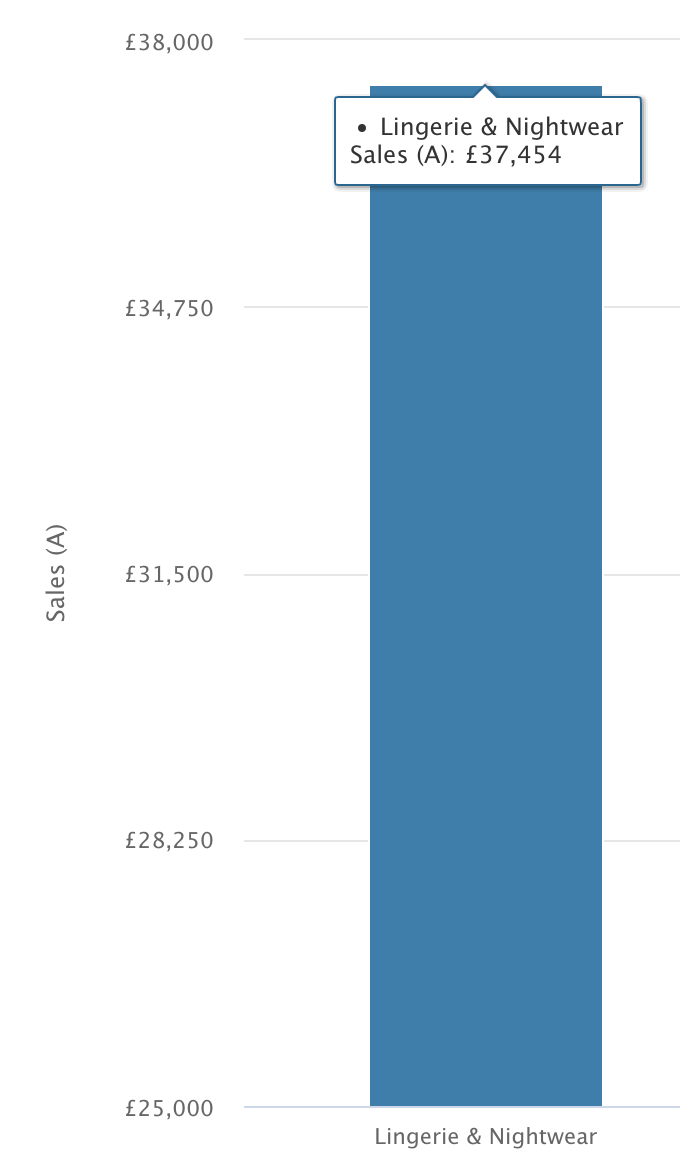
- Hover over each column in the chart to see the exact data value.
- Up to two metrics can be selected to analyze at one time (this will populate an additional line overlaying the chart).
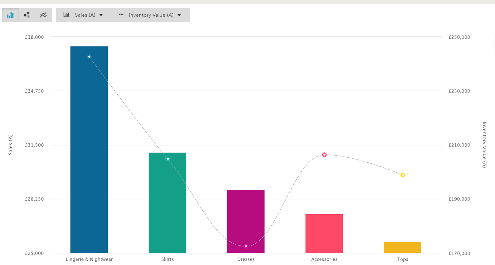
- Y-Axis: Data Value Metric.
- X Axis: Data Type (eg, Categories, Gender, Consumer Groups, Age).
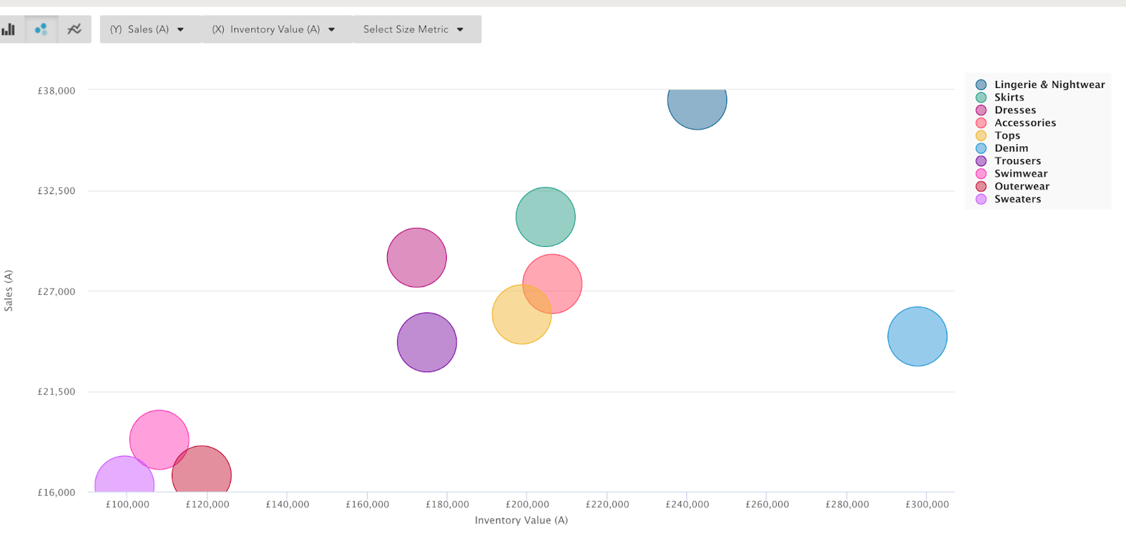
Bubble Chart
The default chart if you’re looking at 1000+ values.
- Hover over the bubble to see the exact values.
- Two value metrics on the X and Y axes are added as default.
- Metric size can be added as an additional metric.
- Click and drag around bubbles to zoom in.
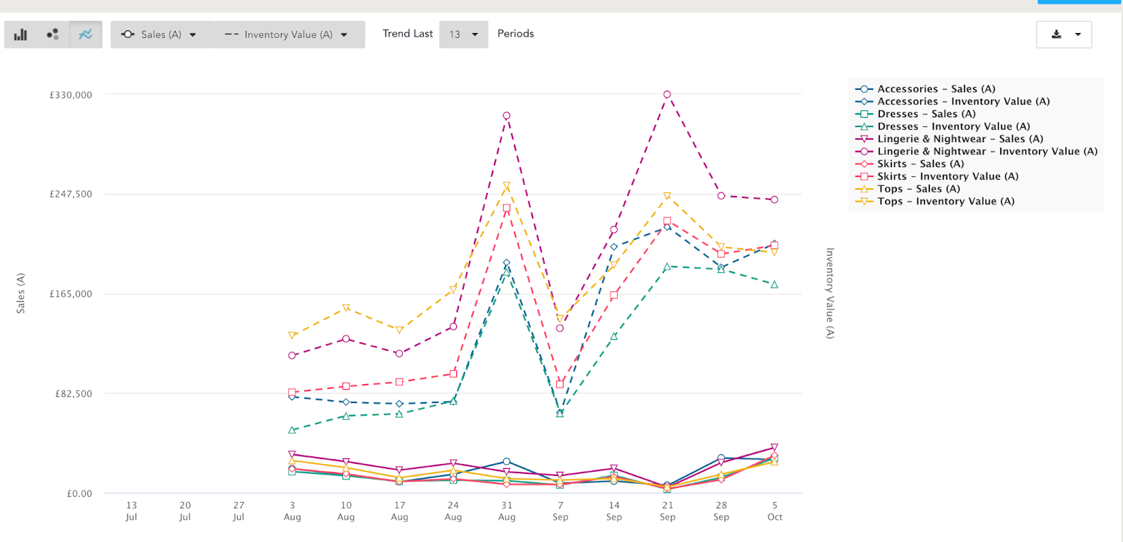
Trend Chart
Toggle to the Trend Chart to view data over a selected period.
- It defaults to 13 weeks, the maximum period that can be analyzed.
- Week periods can be customized.
- Two value metrics are added as default: one on the X-axis and the other represented on the dotted line.
- Hover over each shaped nodule to see the exact values.