-2.png?height=120&name=EDITED%20Logo%20Dark%20-%20Color%20(1)-2.png)
To change the comparison value, open your DynamicView side panel. Click on the drop down in the upper right hand corner and select your desired comparison.
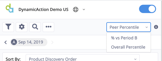
Peer Percentile:
The Peer Percentile comparison value identifies where the product sits relative to its category peers. For example, a product in the 8th percentile in terms of the Product Conversion metric suggests that 92% of other products in its category have higher Product Conversion rates. For most metrics if the metric value for a product is in the 1-30th percentile, it will be colored red. If the metric value is in between the 31st and 69th percentile it will be colored amber and if in the 70th percentile or higher it will be green. Do note that there are some metrics where the percentile values are the opposite. For example, a product having a low Peer Percentile value for the metric Bounce Rate means that the item is less often associated with a one page visit. So for that metric, Peer Percentile values less than 30 would be green and those over 70 would be red.
% vs B:
The % vs B comparison value calculates the percentage change of the metric value in the A period compared to its B period value as specified in the calendar control. For this percent change metric, negative changes are identified via parenthesis surrounding the metric value. The pill will be colored either green or red depending on whether a period over period increase or decrease for the given metric is deemed a positive or negative result, respectively. Again using the metric Bounce Rate as an example, a period over period decline is a positive result and hence the negative percent change metric value would be colored green.
Overall Percentile
The Overall Percentile comparison value is calculated in the same fashion as Peer Percentile but instead of evaluating only products within an item’s category, it looks at all products across your organizations merchandising assortment.