Watch the video below to learn how to use EDITED's History feature.
To view History add a new tab to your workbook by selecting the + symbol:

Then select History:

History allows you to see the different types of events that have occurred in the life-cycle of the products in your workbook such as: New in, In Stock, Discounted, First discounted, Price increase, Sold out and Replenishment.
When you enter History you may see the following notice to remind you to remove the in stock filter:

Calendar View
When you click on the History tab, the default view is Calendar View, showing New in and Discounted for the retailers or brands you have selected.


The left-hand side of the calendar lists the days of the week, and along the top are the months of the year, so each bar on the chart represents a week.
Select whether you want the data in your workbook to be aggregated by Day, Week or Month in the top left of the calendar view.
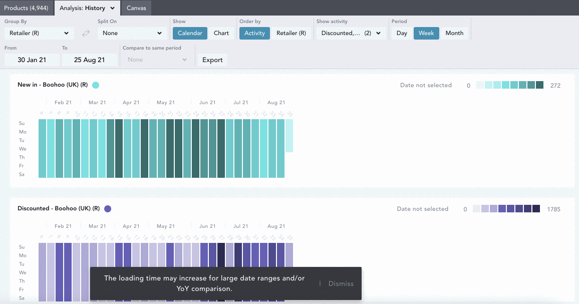
The darker a square is colored, the more events on that particular day.
Hover over a square/bar to see the number events on that day, and click to view the products. In the example below we see that Boohoo had 2,901 products 'New In' on week 21 in May 2021.

Depending when we started tracking the retailer or brand, the Calendar View goes back as far as 8 years.
Exploring Calendar View
You can use EDITED's Chart Controls to alter how the information is presented in Calendar View using the buttons at the top of your workbook.

Use the Group By and Split On drop downs to see your data by:
- Aggregate: see all the products in your workbook represented
- Region: see the data by each region selected in your workbook
- Segment: see the data per market segment selected in your workbook
- Retailer (R): see the data per retailer selected in your workbook
- Brand (B): see the data grouped by the brands selected in your workbook
- Gender: see the data per gender selected in your workbook
- Category: see the data per category selected in your workbook
- Product Details: see the data per product detail selected in your workbook
- Keywords: see the data per keyword grouping in your workbook
- Patterns: see the data per pattern selected in your workbook
In the video below, the data is being grouped by retailer and split on the categories selected -
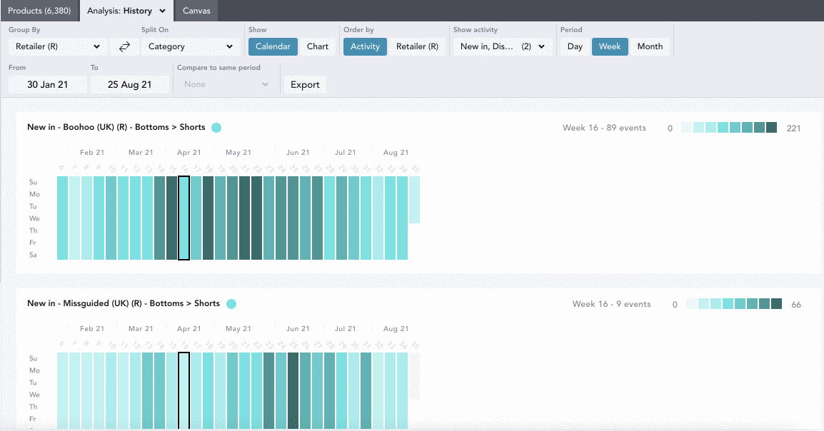
Order by: select to order the calendars by activity or by retailers. In this example we have grouped by activity, which means that all the charts for each series will be grouped together (n.b. if you don't have retailers selected in your workbook, you will be able to order your charts by another criteria such as regions or brands).
Show: select the activity you would like to see. Here we have selected discounted and replenished, which means that we see a calendar for each of these:

Chart View
Chart view presents History information in a different way, select Chart under the Show option to see the information presented as a line chart, rather than a calendar.

Exploring Chart View
You can use EDITED's Chart Controls to alter how the information is presented in Calendar View using the buttons at the top of your workbook.

Use the Group By and Split On drop downs to see your data by:
- Aggregate: see all the products in your workbook represented
- Region: see the data by each region selected in your workbook
- Retailer (R): see the data per retailer selected in your workbook
- Segment: see the data per market segment selected in your workbook
- Brand (B): see the data grouped by the brands selected in your workbook
- Gender: see the data per gender selected in your workbook
- Category: see the data per category selected in your workbook
- Product Details: see the data per product detail selected in your workbook
- Keywords: see the data per keyword grouping in your workbook
- Patterns: see the data per pattern selected in your workbook
Order by: Select to order the calendars by activity or by retailer. In this example we have grouped by activity, which means that all the charts for each activity will be grouped together:

Show Activity: Select the activity you would like to see. Here we have selected New In, Discounted and Price increase which means we’ll see these represented on the charts:

Hover over the chart to see the number of events on a particular day.

Clicking on the chart itself will show you the products that saw activity on the date you have selected.

Selecting In Stock under the Show Activity dropdown will show all products in your workbook that were in stock on any day, week, or month in the selected time period.

Layering New In and In Stock charts together can help you to visualize proportionately how much of the in stock assortment on a given day/week/month was launched new.

*Note: When setting Show Activity to Sell out in the History chart, products will only appear if we have seen 100% of SKUs go out of stock. For instance, a retailer must leave that product page up and advertise the product as sold out, as opposed to simply removing the listing altogether. If the listing is removed, we will infer the product is OOS, but will not consider this a true sell out.
Compare to Same Period: Using the Compare To Same Period, selector, you can compare the data from the selected date range to that of the previous year or 2 years prior. This is represented by dotted lines matching the color of the selected year’s solid line.

When hovering over a week on the graph, a popover will appear displaying the product counts of the previous year or year -1 and the percentage change from then to the base time frame.
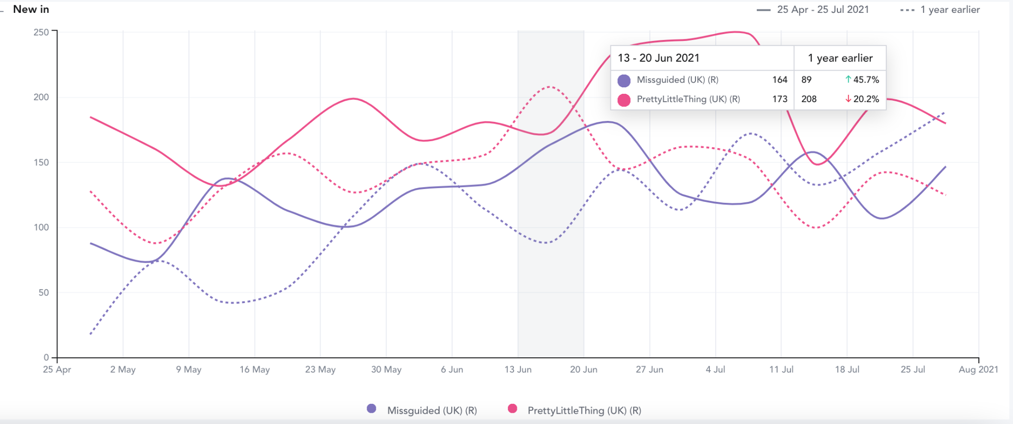
NOTE: Each week range is inclusive → exclusive. This means that the date range will be listed as Sunday-Sunday, and include data collected from midnight Sunday through end of day the following Saturday.
When layering year over year, the data lines up according to the corresponding week/month number. For example, if you’re looking at week #23 out of 52 in 2021, the comparative week will be the corresponding week #23 from 2020 or 2019, despite the numerical dates being slightly shifted. In the monthly view, each month will line up exactly (i.e. January 1-31, 2021 and January 1-31, 2020).
Exporting the History Chart:
You can export the data from the History chart into a CSV file. Make sure the workbook you're working off is saved, and click the blue Export button. Confirm the details of your export, and the data from the History chart will be sent to your email as a CSV file.