Watch the video below to learn how to use EDITED's Assortment feature.
Assortment visualizes the breakdown of product category groups and categories into either a pie chart or a table (examples below).
When you add filters to a new workbook, an assortment chart of your dataset will automatically be generated. If you haven't applied any product category filters, you'll see all product category groups in your charts.
If you want to create a new assortment chart, click on the + symbol next to your chart tabs.
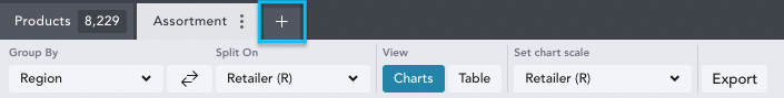
This will bring up a menu of Analysis Types, from which you can select Assortment.
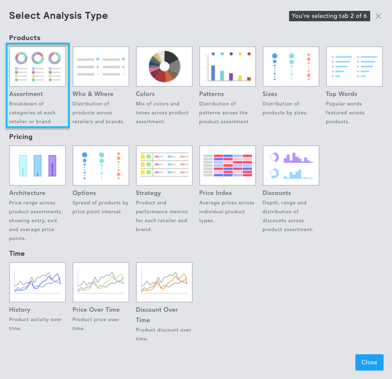
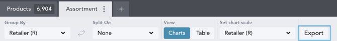
Chart Controls
View allows you to select whether you want to visualize your data as a chart or table.

Group By and Split On allows you to choose how data is grouped.
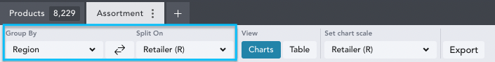
Group By
A full list of Group By options is listed in the dropdown, with more options becoming available as you enter more filters into your workbook.
The most common ways to group data include:
- Aggregate will create one chart/table for your whole workbook.
- Region will create one chart/table per region in your workbook.
- Retailer (R) will create a chart/table per retailer in your workbook.
Split On gives you a further option to organize your data. For example, you may want to compare the same retailers in different regions. In this case, you could group by region and split by retailer.
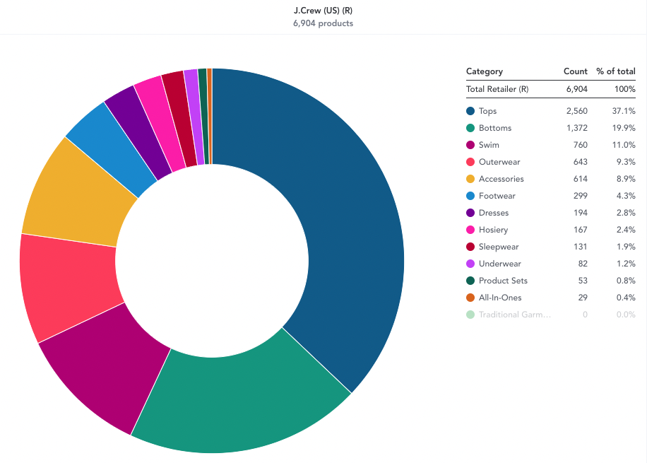
Chart Example:

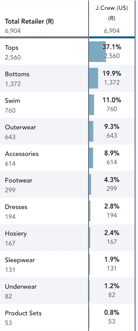
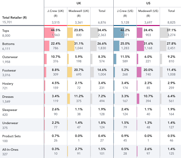
Table Example:
Set Chart Scale allows you to view assortments in three ways:
- The default view shows percentages dependent on your Group & Split selection. For example, if you’ve decided to group by Retailer, your default chart scale option will be set to Retailer. Category groups and categories are ordered by number of products.
Chart Example:

Table Example:
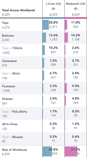
- Across Workbook provides a more granular view of the percentage of a category group or category across your entire workbook, not just what you’ve split on. Category groups and categories are ordered by number of products.
Chart Example:

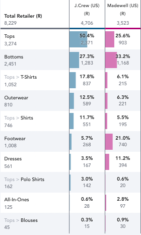
Table Example:
- “Full Assortment” allows you to see category groups or category percentages across retailers’ entire assortments regardless of the category filters you have selected in your workbook. Category groups are ordered by the number of products with any selected categories listed under them.
Chart Example
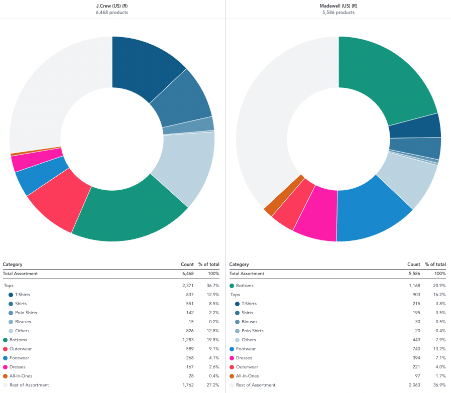
Table Example:

Chart-Specific Functionality
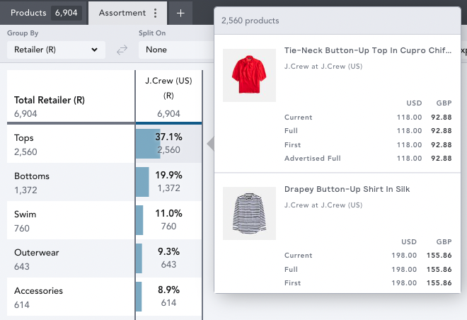
- Hover over any category group/category to highlight it across your charts. The percentage of the section you have selected will be displayed in the center of the chart.

- Click on any section to drill down and see the products contained.

Table-Specific Functionality
- When adding a “Split On” view of your data, an option to “Show” or “Hide” “Totals” appears.

- Click on any of the bars to drill down and see the products contained.
Exporting
The raw Assortment chart data from charts and tables can be exported and emailed to you in Excel format. Ensure your workbook is saved, and then click ‘Export’ at the top of your chart controls.