To view Architecture, add a new tab to your workbook by selecting the + symbol:

Then select Architecture:
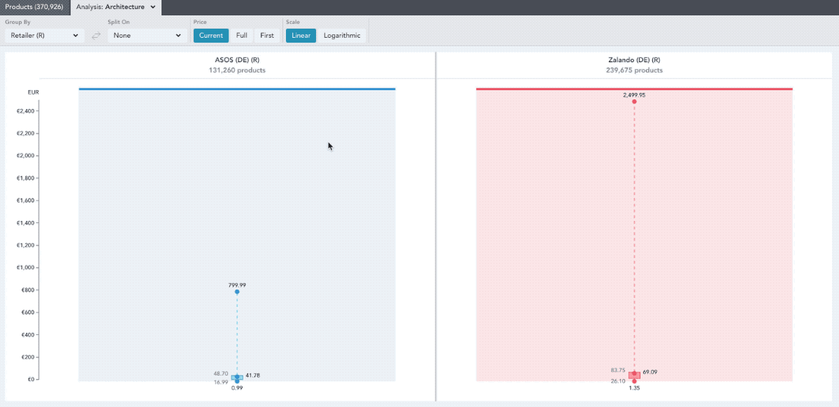
Architecture shows product assortment size by price.
Use the Group By and Split On drop downs to see your data by:
- Aggregate: see all the products in your workbook represented
- Region: see the data by each region selected in your workbook
- Segment: see the data per market segment selected in your workbook
- Retailer (R): see the data per retailer selected in your workbook
- Brand (B): see the data grouped by the brands selected in your workbook
- Gender: see the data per gender selected in your workbook
- Category: see the data per category selected in your workbook
- Product Details: see the data per product detail selected in your workbook
- Keywords: see the data per keyword grouping in your workbook
- Patterns: see the data per pattern selected in your workbook
- Flash Sales: see the data per flash sale selected in your workbook
In the video below, the data has been grouped by retailer and then split on the selected genders:
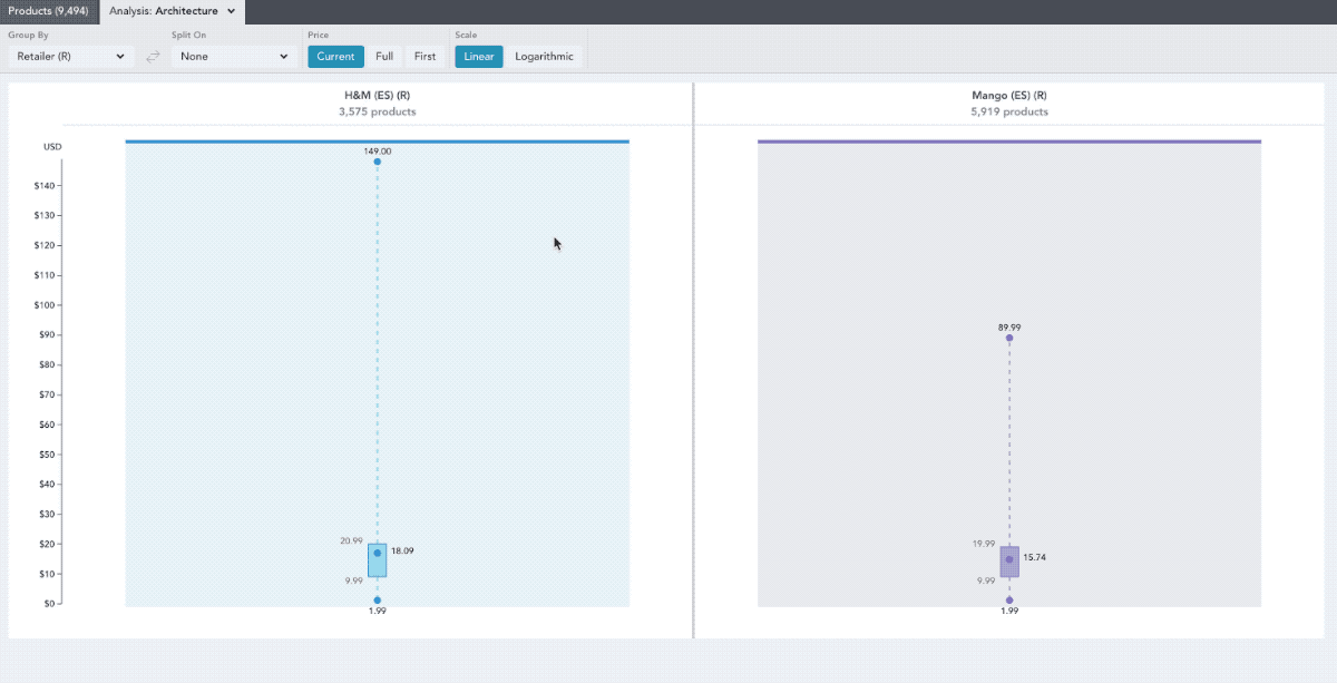
The boxes represent the interquartile range (which is the distance between the first and third quartile). Usually, this is where the bulk of products in that retailer’s assortment are. The dot within each interquartile range will represent the mean, the average price within the set of products.

Use the Scale chart control to adjust how you compare price ranges across retailers.
A scale is a range of values/numbers from lowest to highest that measures something at regular intervals, most simply 1,2,3,4,5...etc.
A linear scale is exactly like the one described above, where the value between two points next to each other never changes.
This is useful when comparing smaller price ranges because each unit of change in price is represented by an equal vertical distance in the graph. For example, the increase from £10 to £20 is represented by the same vertical distance in the graph as a change from £25 to £35, or £100 to £110.
A logarithmic scale is different. Rather than the value between consecutive points remaining constant, it is percentage change in values that represent equal distances from one another e.g the distance between 1 and 2 is the same as the distance between 5 and 10 because in both cases the first number is half of the second
This is useful when comparing larger price ranges because each *unit of percentage change * in price is represented by an equal vertical distance in the graph. For example, the increase from £10 to £20 is represented by the same vertical distance in the graph as a change from £25 to £50 ,or £100 to £200.
Click the points on the graph to see a popover of the products that occur at that price point. The box plots can also be grouped by brand to show the distribution of their assortment. In the example below the box plots are grouped by brand.
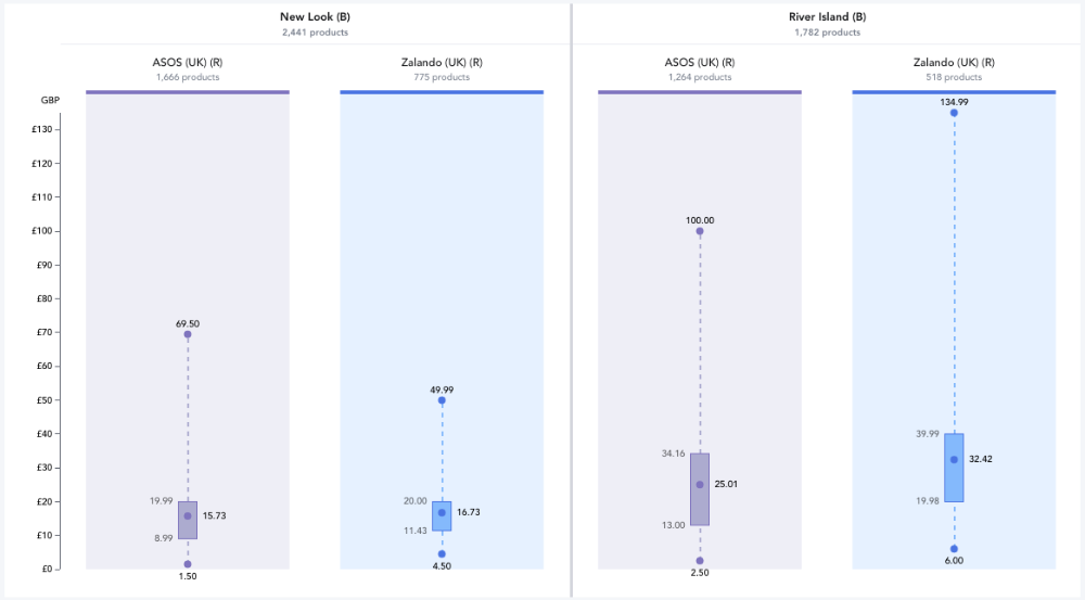
You can alter the state of the prices by selecting the different Price buttons.

- Current will show values at the price the products are listed at now.
- Full will show values at the highest price the products have been seen at.
- Advertised Full Price will show values at the highest advertised price the products have been seen at
- First will show values at the price the product first arrived on the market as.