To view Price Over Time add a new tab to your workbook by selecting the + symbol:

Then select Price Over Time:
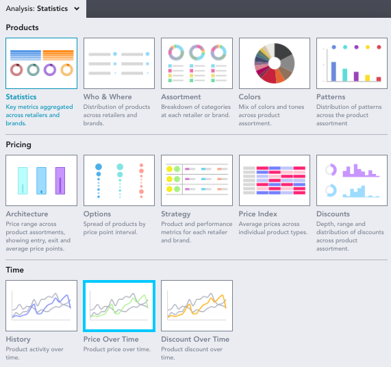
Price Over Time allows you to see how retailers/brands have shifted their price points over a certain timeframe.
When you enter Price Over Time you may see the following notice to remind you to remove the in stock filter:

You can use EDITED's Chart Controls to alter how the information is presented using the buttons at the top of your workbook.

Group and Split: Select how you would like to breakdown and analyze your data by various groups.
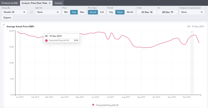
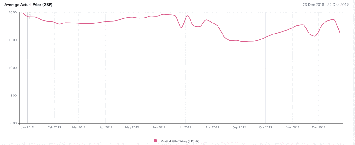
Price: Analyze your workbook by minimum, average and maximum price. In this example, we are analyzing the average price of dresses between December 23rd, 2018 - December 28th 2019:
Price Type: Lets you filter by actual price (the actual price on the selected timeframe) and full price (the highest selling price on the selected timeframe) In this example, where we have filtered to average actual price, the highest price in the week of 8th-15th December at PrettyLittleThing was £18.52:
Period: Select whether you want the data in your workbook to be aggregated by Day, Week or Month. The price that appears in the drill-down is the most frequent price during this time period.
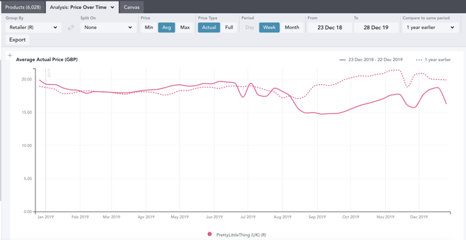
Compare to Same Period: Compare the data from the selected date range to that of the previous year or 2 years prior. This is represented by dotted lines matching the color of the selected year’s solid line.
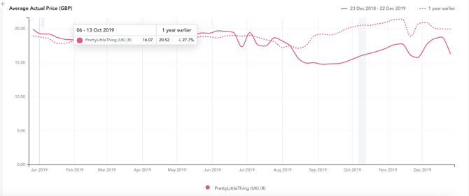
When hovering over a week on the graph, a popover will appear displaying the product counts of the previous year or year -1 and the percentage change from then to the base time frame. For example, in the week of October 06-13, 2019, the average actual price was down 27.7% from that of the year prior.
Export: The export button will allow you to export the minimum, average or maximum price points of the products in your workbook at daily, weekly or monthly intervals. The export will be sent directly to your email address in a CSV file format.
Which week/month are prices falling into for overlapping dates?
- Within the below workbook, you can see that the 25th August date is included in the 18th - 25th Aug 2019 week and 25th Aug - 1st Sept 2019 week.
- The logic of the chart dates means that the week 18th - 25th Aug 2019 = greater than or equal to the 18th and less than the 25th, and 25th Aug - 1st Sept 2019 = greater than or equal to the 25th and less than the 1st.
- This means that prices tracked on the 25th August will be included in the 25th Aug - 1st Sept 2019 week.
When using the Compare to Same Period selector, how does the YOY data match up
- When layering year over year, the data lines up according to the corresponding week/month number. For example, if you’re looking at week #23 out of 52 in 2021, the comparative week will be the corresponding week #23 from 2020 or 2019, despite the numerical dates being slightly shifted
- In the monthly view, each month will line up exactly (i.e. January 1-31, 2021 and January 1-31, 2020).