Watch the video below to learn how to use EDITED's Discount Over Time feature.
To view Discount Over Time add a new tab to your workbook by selecting the + symbol:

Then select Discount Over Time:

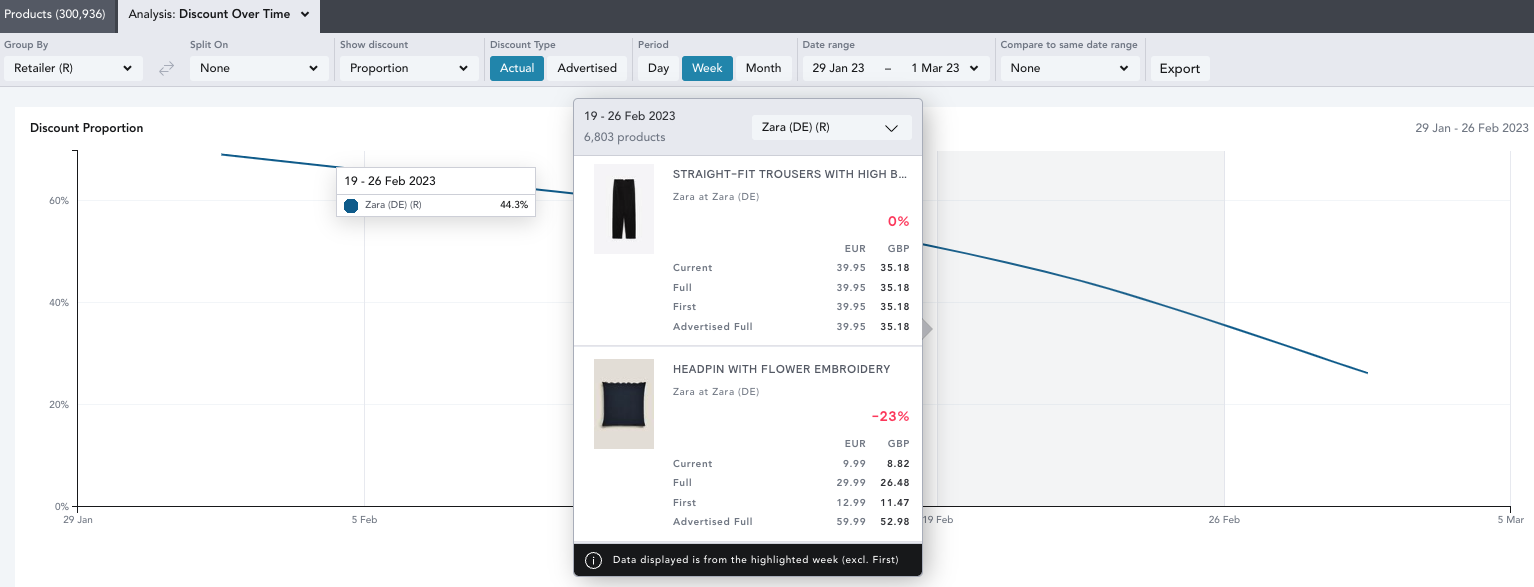
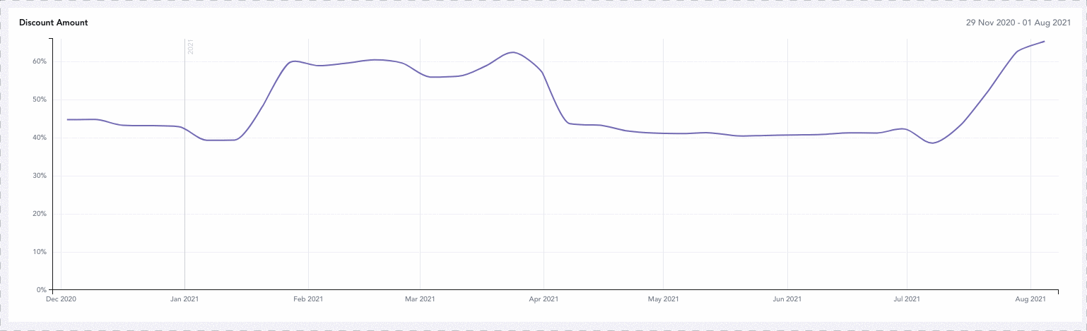
Discount Over Time allows you to see how retailers/brands have shifted their discounting strategy over a specific time period.
Within this chart, you're analyzing products that our trackers have seen as discounted or with an advertised discount on that given day/week/month. The majority of these will likely be in stock at the time we see them as discounted however, there may be some products that are out of stock that the retailer has kept on their website as discounted, meaning we still include the discount within this chart.
You can use EDITED's Chart Controls to alter how the information is presented within your analysis.
Group and Split:
- Select how you would like to analyze your data. In the below example, we have grouped by retailer and split on brand to analyze discounts for Puma and Reebok across ASOS and Zalando individually:

Show Discount: Toggle between Amount and Proportion
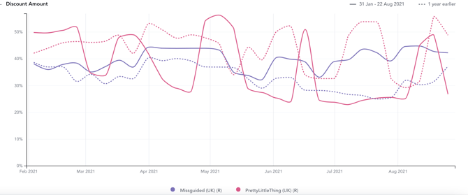
- Amount: Analyze the average discount percentage applied across all discounted products
- Proportion: Review the number of products that have been discounted over your selected timeframe.
Discount Type:
- Actual: The actual historical price of a product's cheapest SKU
- Advertised: The discount communicated by a retailer to a customer
Period:
- Select whether you want the data in your workbook to be aggregated by Day, Week, or Month.
Compare to Same Period:
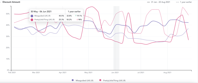
- Compare the data from the selected date range to that of the previous year or 2 years prior. This is represented by dotted lines matching the color of the selected year’s solid line.
When hovering over a week on the graph, a popover will appear displaying the product counts of the previous year or year -1 and the percentage change from then to the base time frame.
Export:
- The export button allows you to export the average discount amounts or the discount proportions of the products in your workbook on a daily, weekly or monthly basis.
- The export will be sent directly to your email address in a CSV file format.
How do I know which week/month the discounts are falling into for the overlapping dates?
- Within the below workbook, you can see that the 11th July date is included in the 4th - 11th July 2021 week and 11th - 18th July 2021 week.
- The logic of the chart dates means that the week 4th - 11th July 2021 = greater than or equal to 4th and less than 11th, and 11th - 18th = greater than or equal to 11th and less than 18th.
- This means that discounts on the 11th July will be included in the 11th - 18th July 2021 week.
When using the Compare to Same Period selector, how does the YOY data match up?
- When layering year over year, the data lines up according to the corresponding week/month number. For example, if you’re looking at week #23 out of 52 in 2021, the comparative week will be the corresponding week #23 from 2020 or 2019, despite the numerical dates being slightly shifted
- In the monthly view, each month will line up exactly (i.e. January 1-31, 2021 and January 1-31, 2020).
Why would a product show as 0% discount?
- An option is considered discounted if it was discounted at any point during that week. However, if for example a product was only discounted for 1 out of the 7 days of the week, as its most frequent overall discount value is 0, this will then show as a 0% discount in the drill down as for the majority of the time, the product was not discounted.