-2.png?height=120&name=EDITED%20Logo%20Dark%20-%20Color%20(1)-2.png)
Widgets offer you different ways to visualize the dataset that you have filtered to be in your dashboard. They each answer a specific question relating to top level metrics, assortment or pricing. Ensure that you have added Enterprise and/or Market filters into the filter panel prior to adding widgets.
Adding a Widget
To add a widget to your dashboard, select the “+ Widget” icon at the top right of your dashboard. If it’s a new dashboard, you can also select “+Widget” from the center of your dashboard.

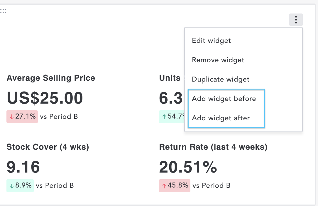
If you already have a widget in your dashboard, you can click on the vertical three-dot menu in the top right-hand corner of a widget to add another. This also gives the option of whether to place the new widget before or after the existing widget.
You can choose from a list of analysis widgets that will help bring you fast and digestible insights into different data metrics. Widget cards highlight if they can be used with Enterprise or Market data.
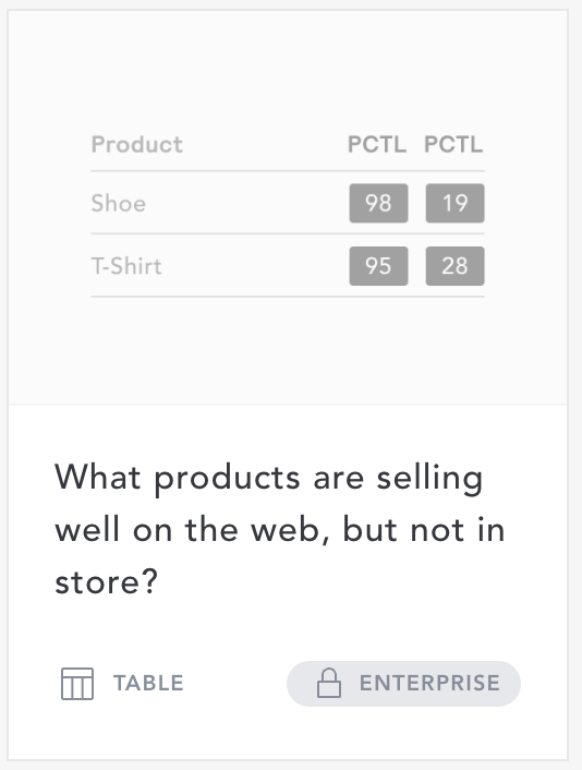
If you don’t have access to either Enterprise of Market data, the card will be greyed out.
Use the “Type” selector at the top of the page to view only Enterprise or Market widgets. This choice will remain each time you add a new widget within your current dashboard unless you change it.
You can also use the search bar if you know the specific widget you’d like to add.

Types of Widgets
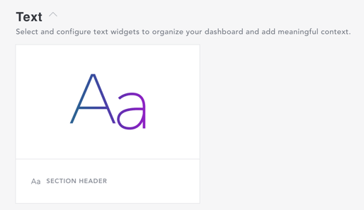
Text Widget
Organize your dashboard into digestible sections by inserting section headers and optional descriptive text.
Metric Widgets
Select and configure these metric widgets to understand metric performance, movement versus a comparison period, trends and to view top or worst-performing products and top field values by your desired metric.

Assortment Widgets
Select from these best practice assortment widgets to understand which products are impactful for your own business and competitors, and where you might find white space opportunities.

Pricing Widgets
Select from these best practice pricing widgets to identify pricing trends across your own business and the wider market, highlighting competitive opportunities.

Widget Functionality & Charting
While there are widgets set up for many different types of analysis. There are six types of charts that the widgets can produce.
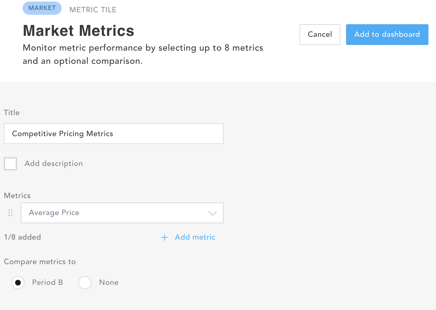
“Metric Tile” allows you to monitor metric performance by selecting up to eight metrics and an optional comparison.
- Decide on the title you’d like to show on your dashboard. Here we’ve chosen ‘Market Metrics”
- Select a metric from the “Metrics” dropdown.
- While hovering over the list you’ll see an explanation of each metric.
- Select “+ metric” to choose up to eight additional metrics.
- Click the “Add to dashboard” button at the top right of the screen.
Building a Metric Tile Widget:
Metric Tiles in a Dashboard:
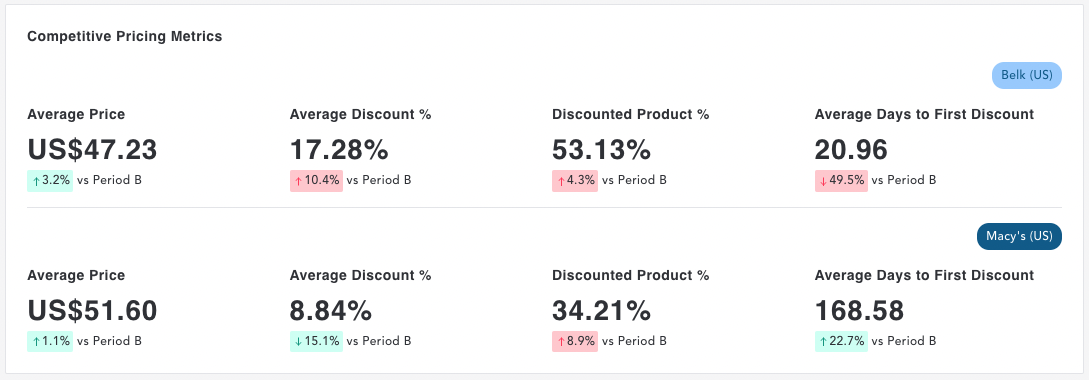
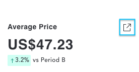
- Hovering over a metric will reveal a link to open up the related workbook in EDITED Market or chart in EDITED Digital/Omni. .
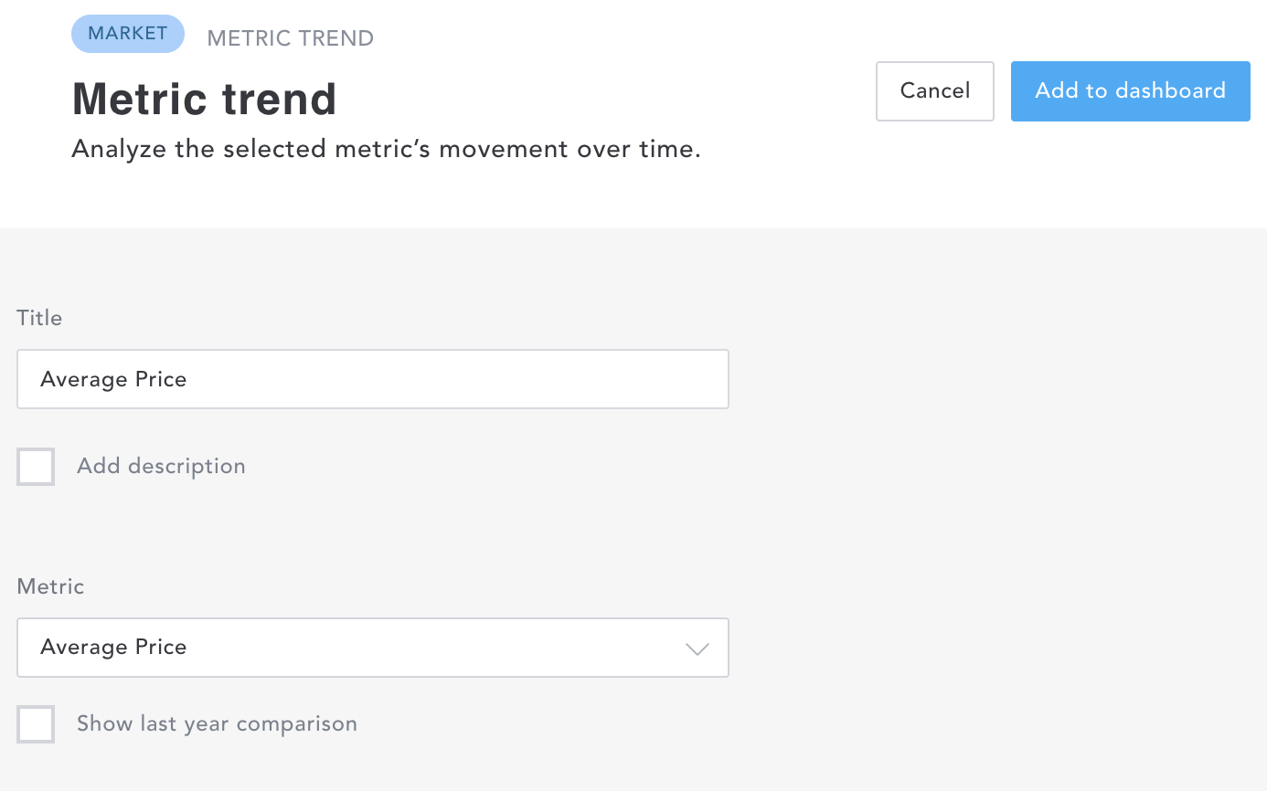
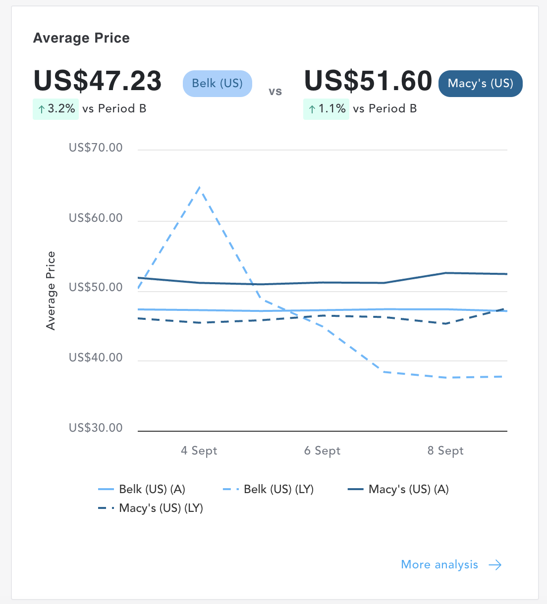
“Metric Trend” allows you to analyze the selected metric’s movement over time.
- Decide on the title you’d like to show on your dashboard. Here we’ve chosen ‘Average Price”
- Select a metric from the “Metric” dropdown.
- While hovering over the list you’ll see an explanation of each metric.
- You have the option to show the previous year as a comparison.
- Click the “Add to dashboard” button at the top right of the screen.
Building a Metric Trend Widget:
Metric Trend in a Dashboard:
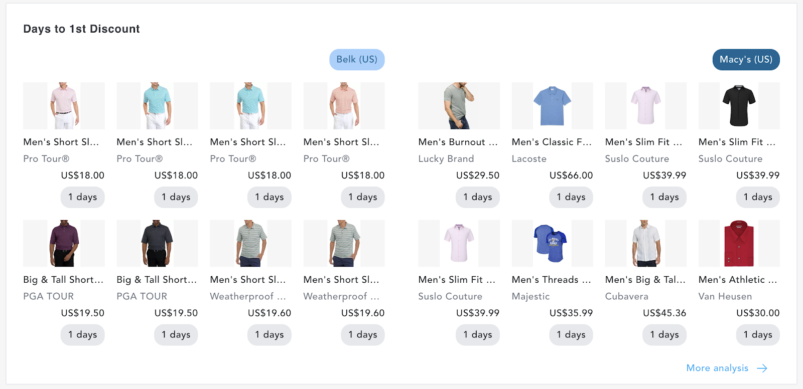
“Product Card” widgets display product image cards sorted by the selected metric.
- Decide on the title you’d like to show on your dashboard. Here we’ve chosen ‘Days to 1st Discount”
- Select a metric from the “Metric” dropdown.
- While hovering over the list you’ll see an explanation of each metric.
- Select how you would like your product cards sorted - descending or ascending.
- Click the “Add to dashboard” button at the top right of the screen.
Building a Product Card Widget:

Product Card in a Dashboard:
“Table” widgets analyze product fields sorted by metrics.
This widget functions slightly differently depending on the data you are analyzing.
Tables of this type categorized under “Metrics” - “How do market products rank by metric” (Market) and “How do our products rank by metric?” (Enterprise). Metric Table widgets allow you to visualize multiple metrics in one place.
- Decide on the title you’d like to show on your dashboard. Here we’ve chosen “Average Discounts by Retailer”
- Select what you would like to analyze from the dropdown. More options become available here depending on what you’ve added to your filter panel.
- Select which metric you would like to sort by.
- While hovering over the list you’ll see an explanation of each metric.
- Sort how you would like to order your metrics - high to low, or low to high.
- You have the option to add a second metric.
- You have the option to compare metrics, with option “vs B period” as per your calendar date selection or “Primary vs Comparison difference”, which allows you to add a third data point based on what you’ve selected within your “+ Comparisons” filter pill.
- Click the “Add to dashboard” button at the top right of the screen.
Building a Metric Table Widget:

Metrics Table Widget in a Dashboard:

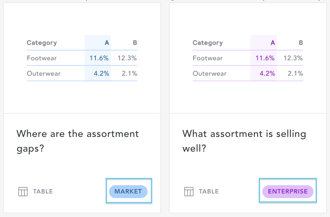
All other Tables categorized under “Assortment” and “Pricing” identified with this icon highlight gaps and intervals within datasets so are based solely on the fields and comparisons you have entered into your filter panel. There is no further option to customize this widget. Simply select the widget and add it to your dashboard.
Assortment Table Widget in a Dashboard:

“Opportunities” widgets compare products to their peers at their lowest category level to identify opportunities in pricing and exposure.
Opportunities widgets are for Enterprise data only. These widgets are based solely on the fields you have entered into your filter panel. There is no further option to customize this widget. Simply select the widget and add it to your dashboard.
Opportunity Widget in a Dashboard:

“Bubble Chart” widgets look at the relationship between three metrics, with each bubble representing a single data point with the variables indicated by horizontal position, vertical position, and dot size.
Bubble Chart widgets are based solely on the fields you have entered into your filter panel. There is no further option to customize this widget. Simply select the widget and add it to your dashboard.
Bubble Chart Widget in a Dashboard:

Further Analysis
At the bottom of each analysis widget, you’ll find a link (or links) out to further analysis. This will take you directly to either EDITED Market or EDITED Digital/Omni charts and reports related to that widget's insights.

Your version of myEDITED may be Market only or Enterprise only, rather than both. 'Market' refers to the data found within EDITED Market Analysis while 'Enterprise' are your own internal business metrics that are fed into EDITED Digital or Omni.
If one of these options is greyed out in your view, then your plan does not include both features. Please contact your account manager or email support@edited.com for more information.